〰️ ATTENTION
〰️ THESE ARE EXTRAS AND MISFITS AND AS SUCH, MAY APPEAR UNFINISHED. THAT'S PROBABLY BECAUSE THEY ARE. DON'T TAKE THIS PAGE TOO SERIOUSLY, IT WAS FUN FOR ME.
〰️ ATTENTION 〰️ THESE ARE EXTRAS AND MISFITS AND AS SUCH, MAY APPEAR UNFINISHED. THAT'S PROBABLY BECAUSE THEY ARE. DON'T TAKE THIS PAGE TOO SERIOUSLY, IT WAS FUN FOR ME.
Honorable Mentions
These are some smaller projects that still hold a happy place in my heart. Some of these are one off logo’s for friends, very old student work that I don’t think is horrific, small freelance projects, or just something I did for fun.


Adrift Shirt
This shirt & shoot were done in 2018 right as all of us were about to graduate from college. We all felt pretty adrift in that we were being released from school and were to set off in the world but none of us had a plan. We weren’t really sure where to go next, we were wanderers with no masters and no plans. We were, in a sense, Rōnin. I designed and had this shirt printed, built a set in my small apartment, and brought my friend Kevin over to model. This was a really fun project that brought some unique challenges and learning opportunities.
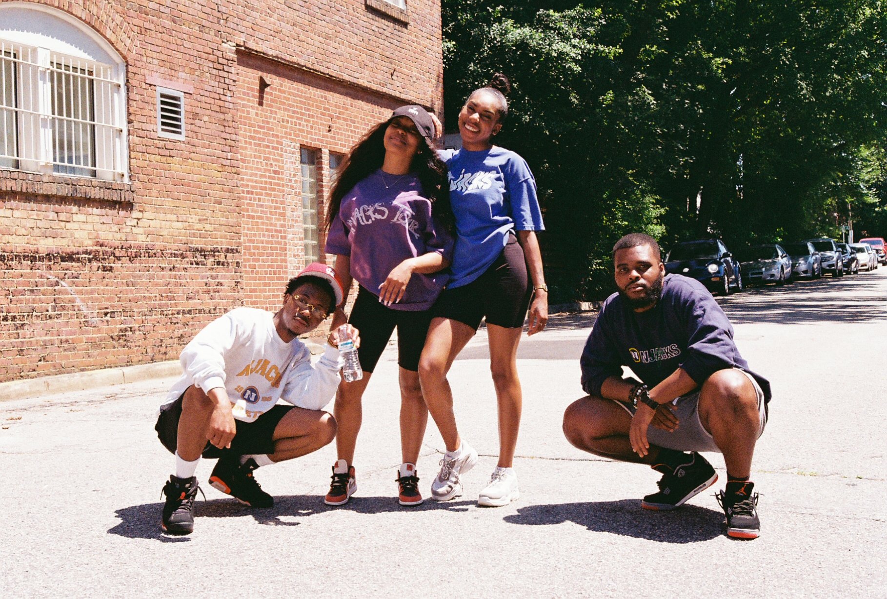
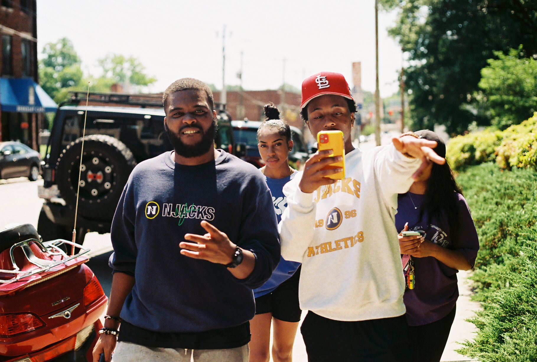
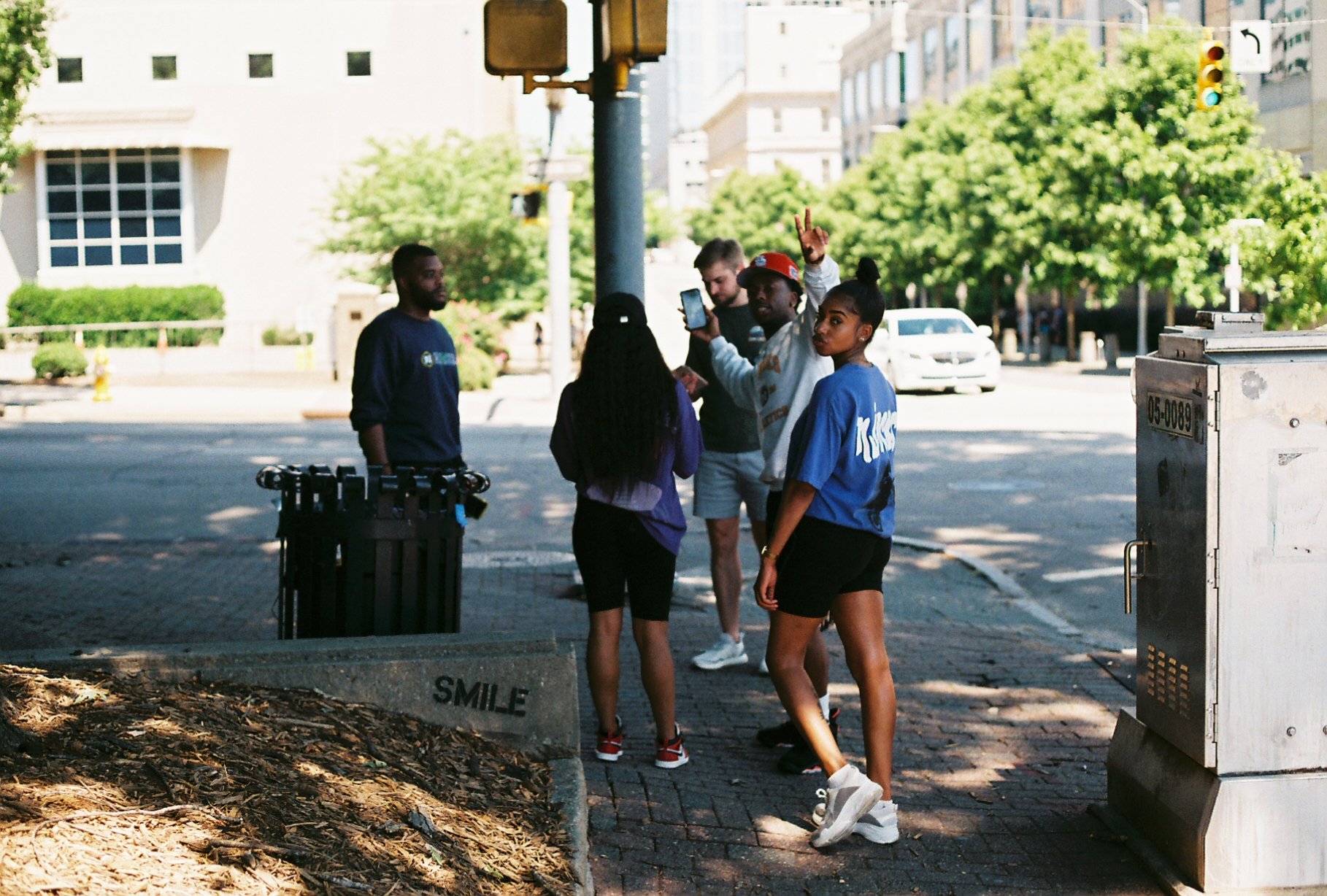
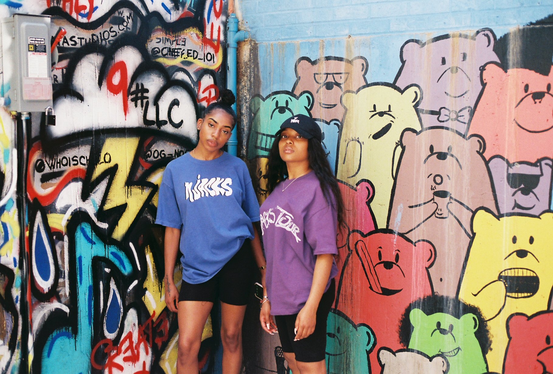
Film Photography
In college, I was able to take several photography and darkroom printing courses and forever fell in love with film. I really enjoyed having to be more intentional about taking photos and being patient to get the results. Many pictures that I thought would be amazing ended up not being so perfect. It helped me learn to accept failures as a part of the creative process, and to seek to understand the problem to correct it for the future, and also to accept that sometimes, shit happens.


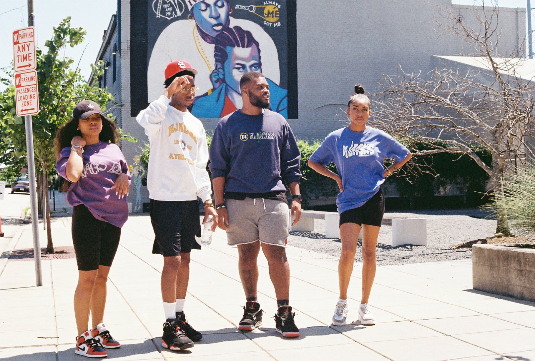
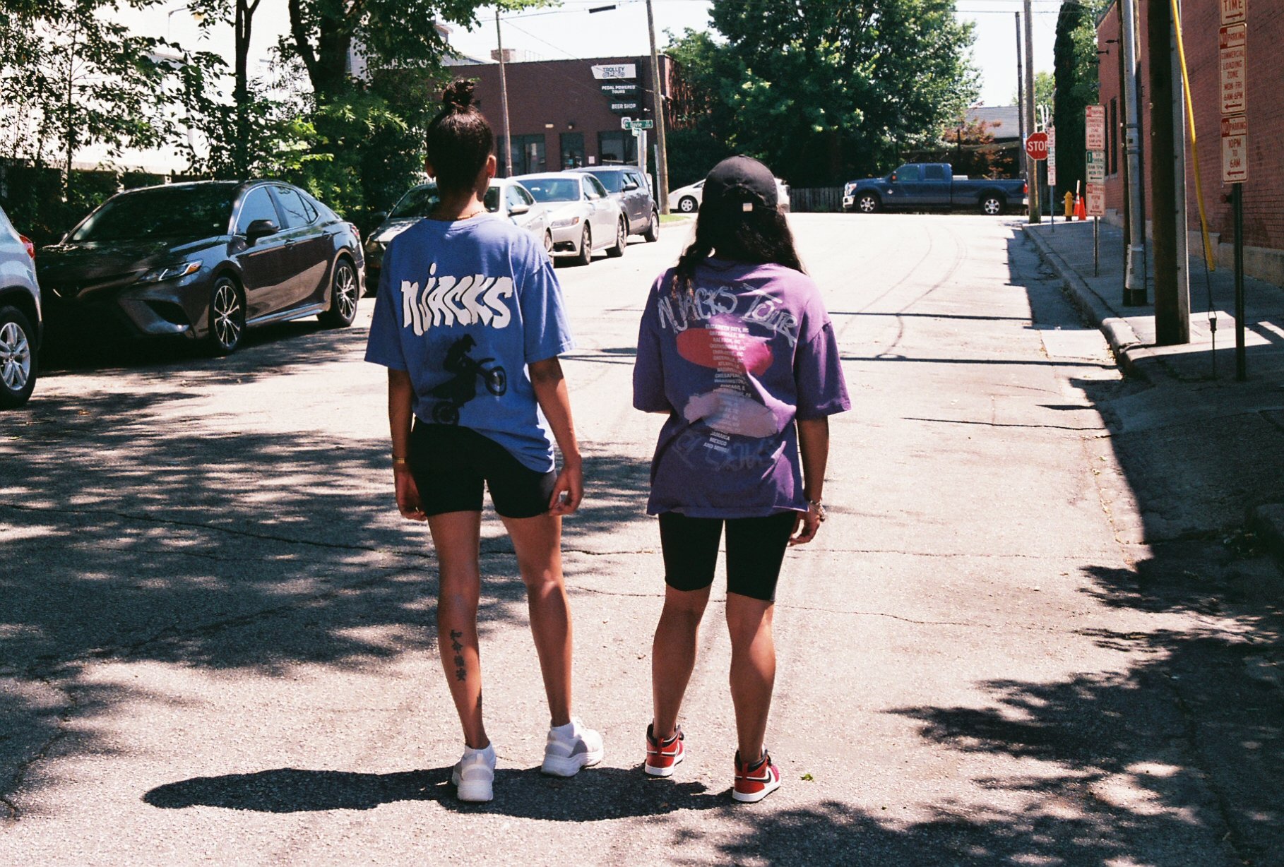
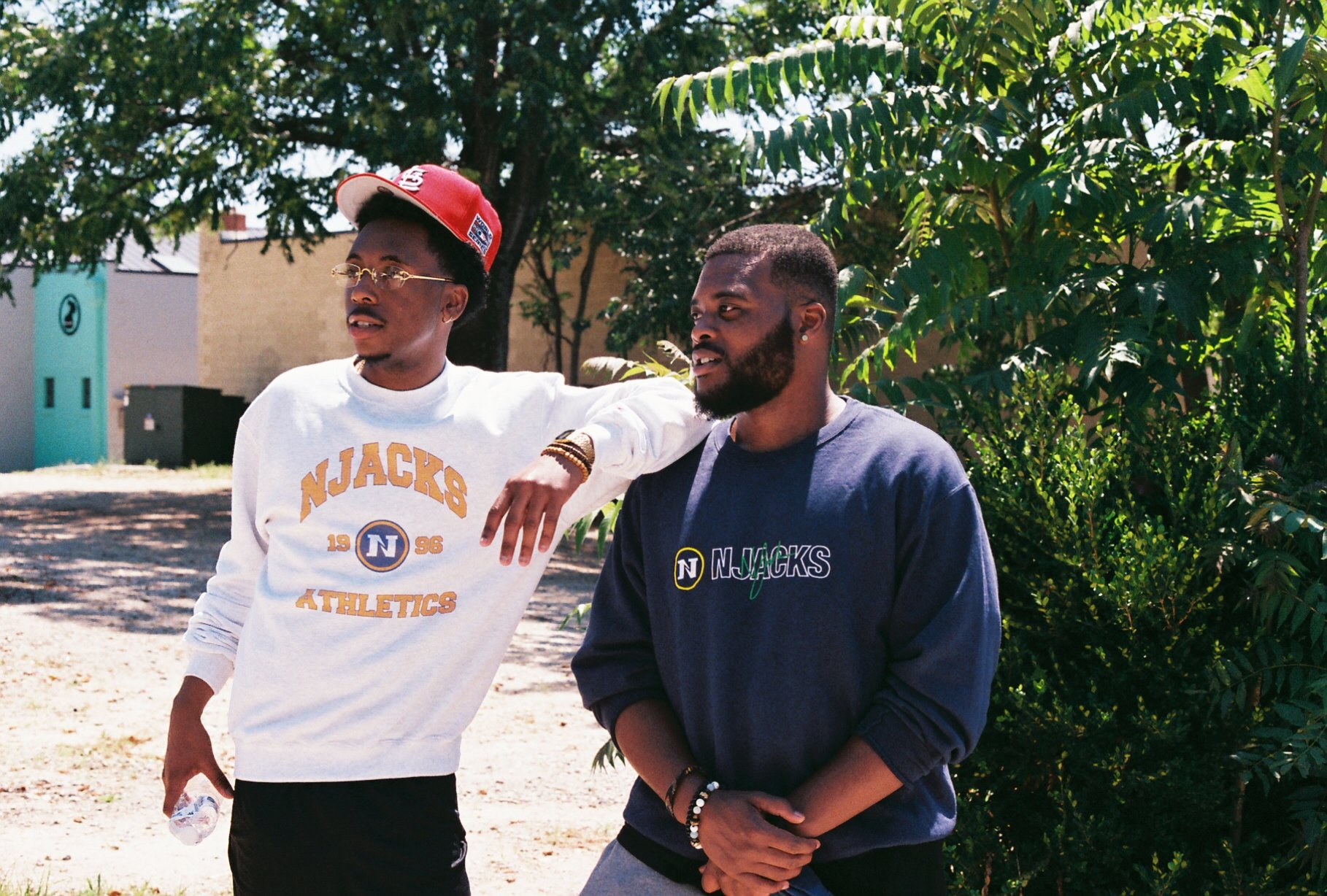
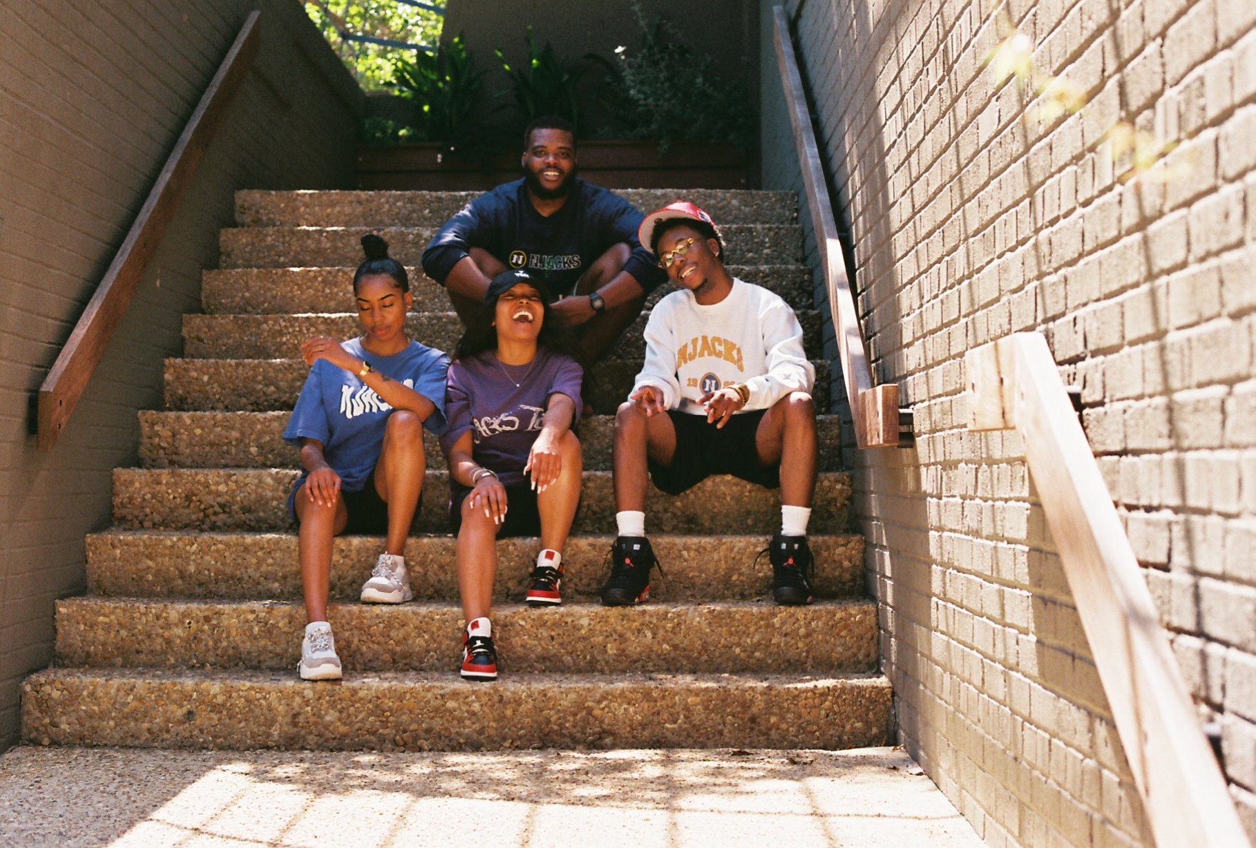
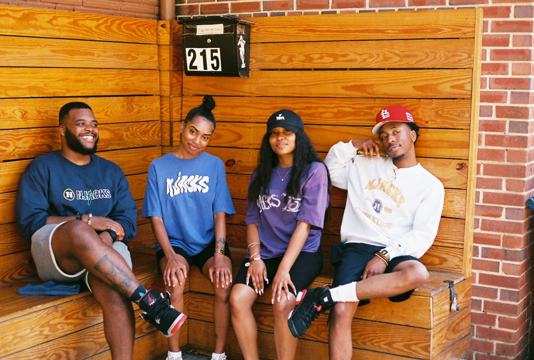
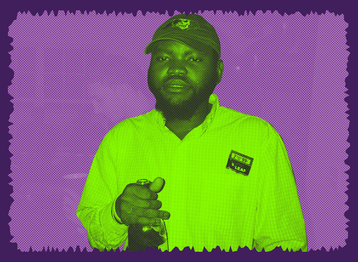
NJacks Anniversary Shoot
June 26th, 2020 and still shooting film, my man Naquan was celebrating his first full year of his clothing brand called NJacks. He has celebrated this anniversary 4 times now and this day is now called NJacks Day. Shop here https://www.njacksco.com/
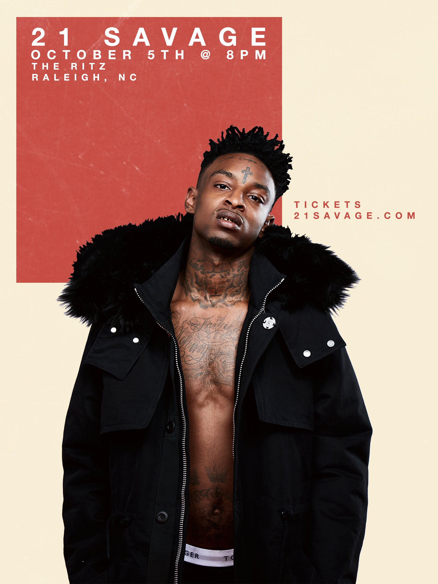
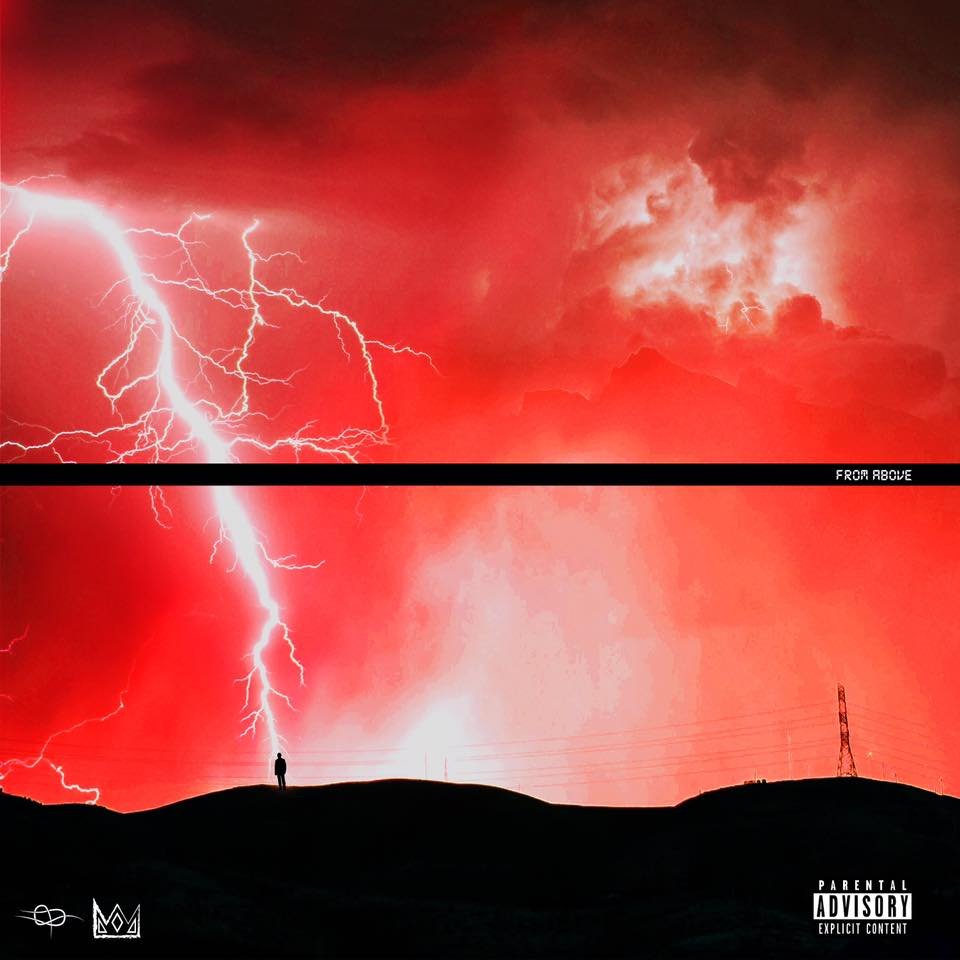
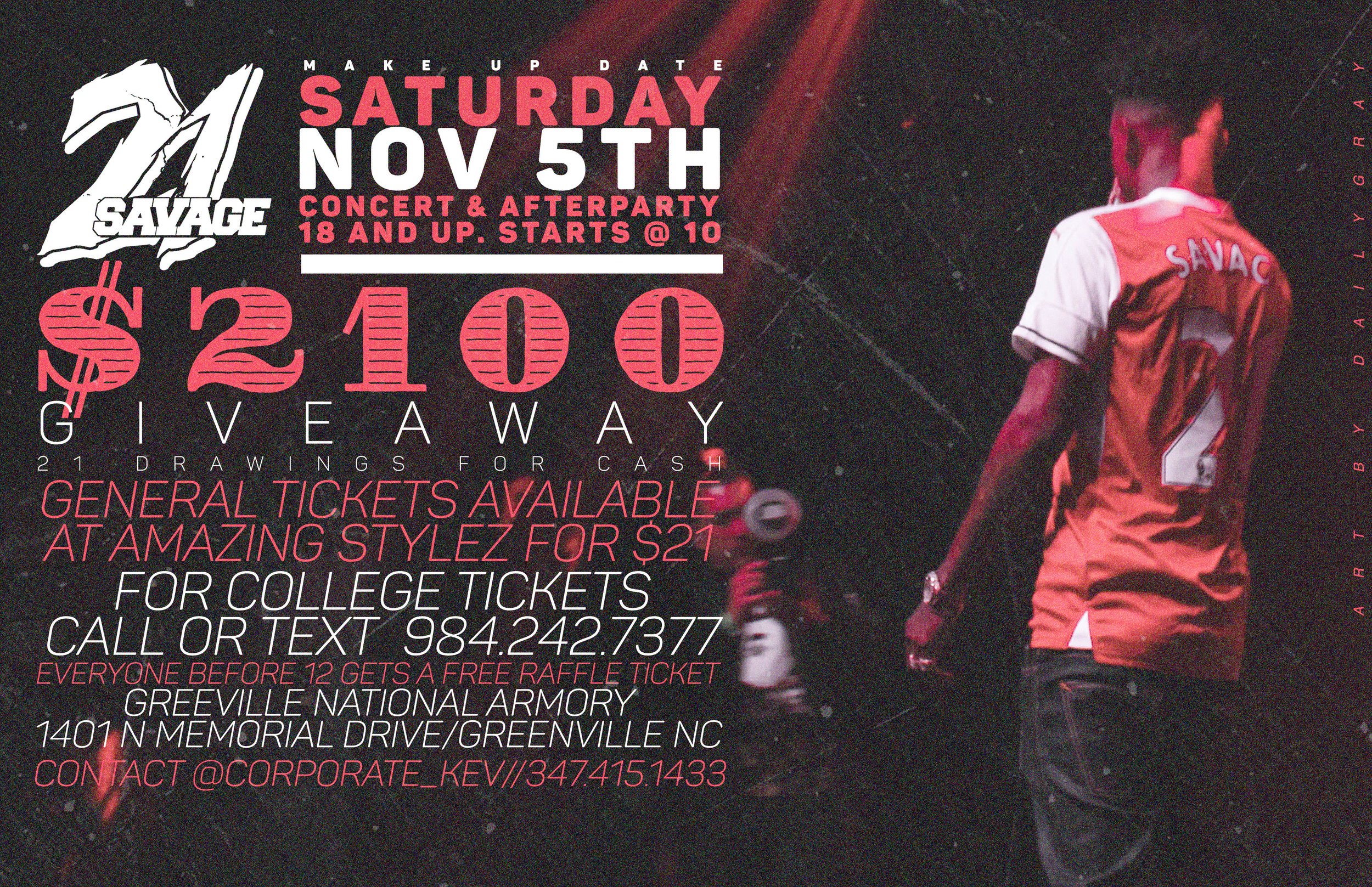
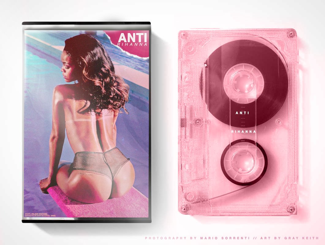
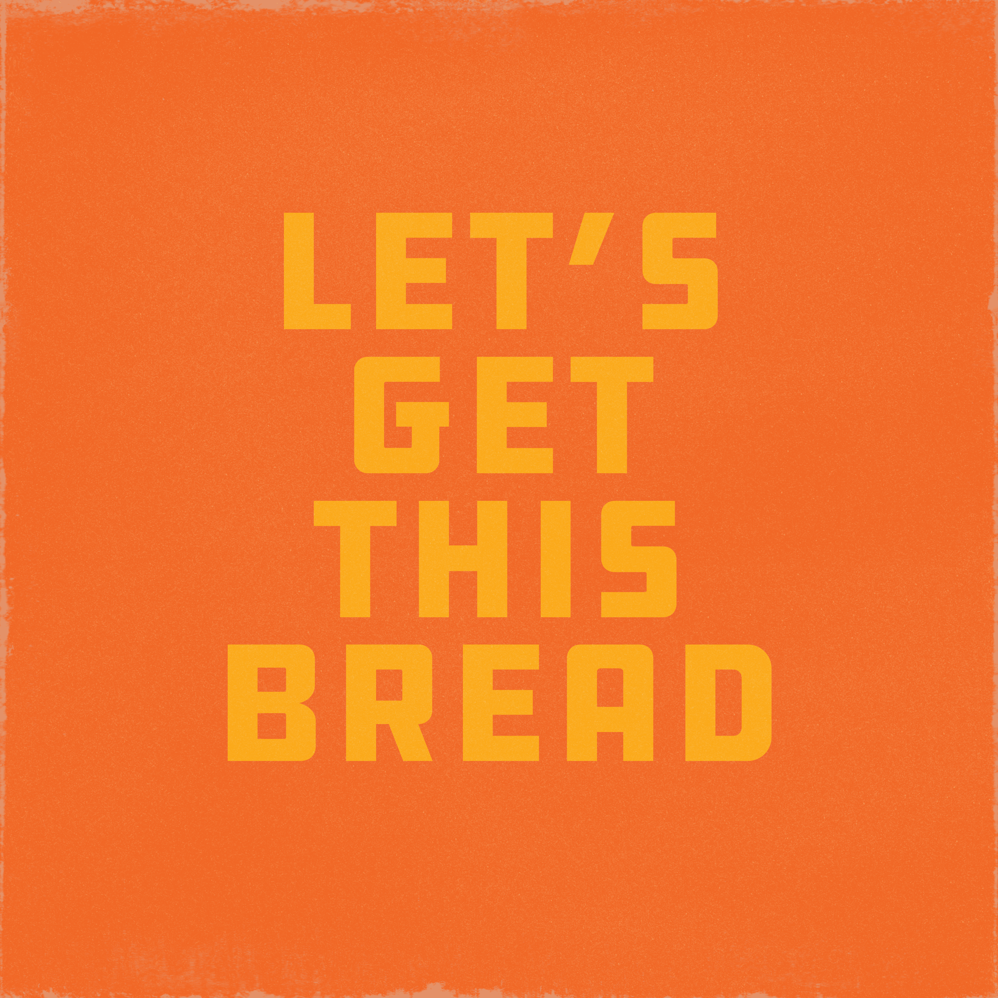
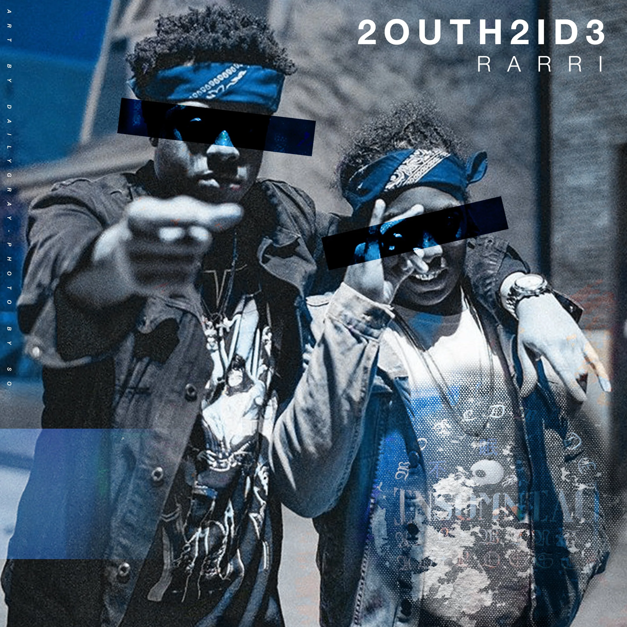
Cover Art, Function Flyers, Music Stuff
I used to hustle cover art and social fliers for extra cash (still do, no shame). I always thought it was a really fun way of getting to explore new techniques (you can see I loved my blend modes) and I also loved meeting new people and finding new music, plus it paid for my 3 AM cookout runs. Definitely used to make some typographic and illustrative choices I wouldn’t make today, but this work was really important in my personal development and helped me grow my understanding for design and illustration.


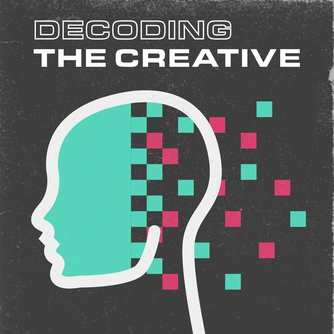
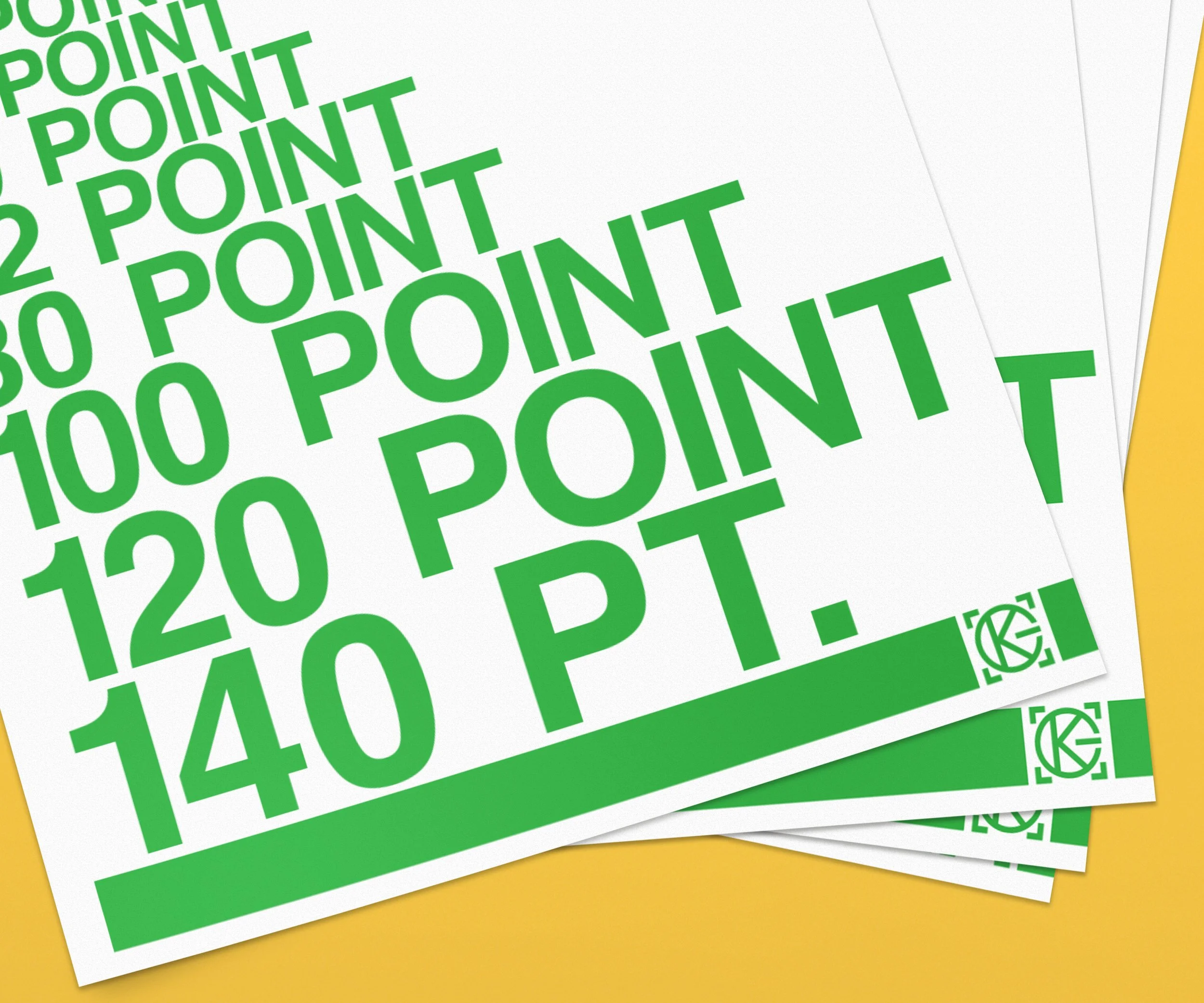
Personal Identity Explorations
Above is a selection of random work done as an exploration of my own personal brand identity and was done to push my own relationship with design and typography. I still use this visual identity across my own work and whenever I need to make something like a reference sheet or a label.
While I don’t typically use a logo anymore, I have stuck with a relatively strict usage of dramatic black-and-white typography and illustration in order to put emphasis on the work itself. Wise people have said “if it aint pretty in black and white, it sure as shit won’t be in color” and while I’m not sure I would call my personal identity “pretty” I do like to think it’s clean and allows the branded work I do to take charge and remove my “voice” as a distraction to the viewer. Maybe it’s design thinking, maybe it’s pretentious.


Daily Explorations
What started as me copying a tile letterform outside of Chuck’s created by Joshua Gajownik and thinking I would build a font, turned into a never-ending exploration of illustration and lettering. Many of these started as simple sketches and I happened to find something cool, or I saw something someone else made and wanted to emulate it.